Infographics | Improving my work
Yesterday I had an Interview with a Head of UX Design from Rapid 7 and I am glad that it went well, however took his advice of self improvement and thought to re-make some of my previews designed work.
As a designer I think I will always improve no matter how good I might become and I think it is essential to adjust the new skills to even some of the old designs that I have done.
So I had this horrible looking Infographic from last years Design Module from Uni and it hit me how much I hated it. It’s horrible, last year I thought it was great, now I can’t even look at it. So what does a person do when their design is hideous to them now? REMAKE! Hey, all the old Ps2 games are getting a remake, so why shouldn’t my little design get one?
I had nothing to loose but a lot more to gain. After all doing things like this really boosts the portfolio.
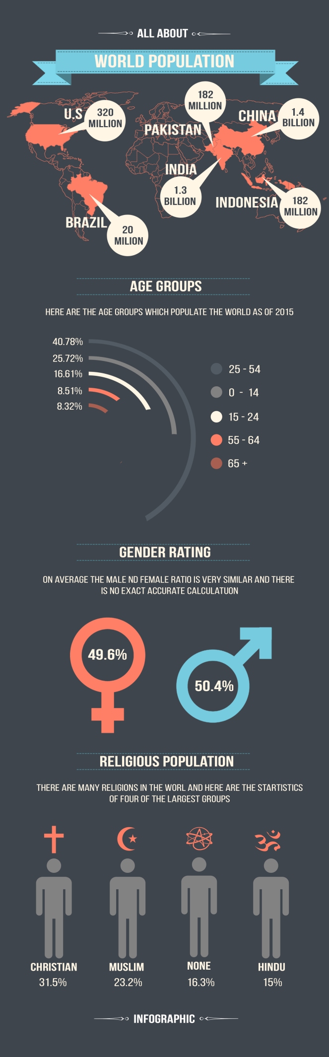
The design below is inspired by simplistic matte colours and some new graph styles which I seen on Pinterest. I think sticking to the exact same colour scheme of a few simple colours was a good choice, I am very happy with the over all look, especially with my new favourite Beebas font which really enhances the style.
Feel free to leave a comment on what you guys think about the design.